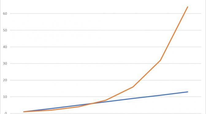
Epidemics and Exponential Growth
Some of the most important information about the Coronavirus (Covid-19) epidemic is to be found not from medical knowledge or in the lab but from basic mathematics. The key to understanding this behaviour is in the mathematics of exponential growth. What does this mean? There are two ways in which regular increases of anything can occur – either by constant addition – arithmetic growth – or by constant multiplication – exponential growth. We can illustrate the difference by starting from 1. If there is daily arithmetic growth of 2, then on the second day the total will be 1 + 2, so 3, on the third day the total will be 1 + 2 + 2, so 5, on the fourth day 1 + 2 + 2 + 2, so 7, and so on. If there is daily exponential growth of 2, then on the second day the total will be 1 × 2, so 2, on the third day 1 × 2 × 2, so 4, on the fourth day 1 × 2 × 2 × 2, so 8, and so on. The difference is in the sign – a plus sign in the case of arithmetic growth, a multiplication sign in the case of exponential growth. As is made clear by Chart 1 below, although the arithmetic growth gives higher totals initially, exponential growth very quickly afterwards leads to higher and rapidly increasing values.
Epidemics cause exponentially increasing numbers of cases because for every person who is infected, that person can in turn infect another. The number of people each infected person in turn infects every day multiplies the number of cases. If we start off with one person who then infects one other over 24 hours, and these two each infect another over the following 24 hours, and all four infected each in turn infect one other the next day, and so on, then we have the daily exponential growth of 2 we described above. This might be quite an extreme epidemic, but in any case where the number of new infections is increasing each day, the growth will be exponential, rather than arithmetic.
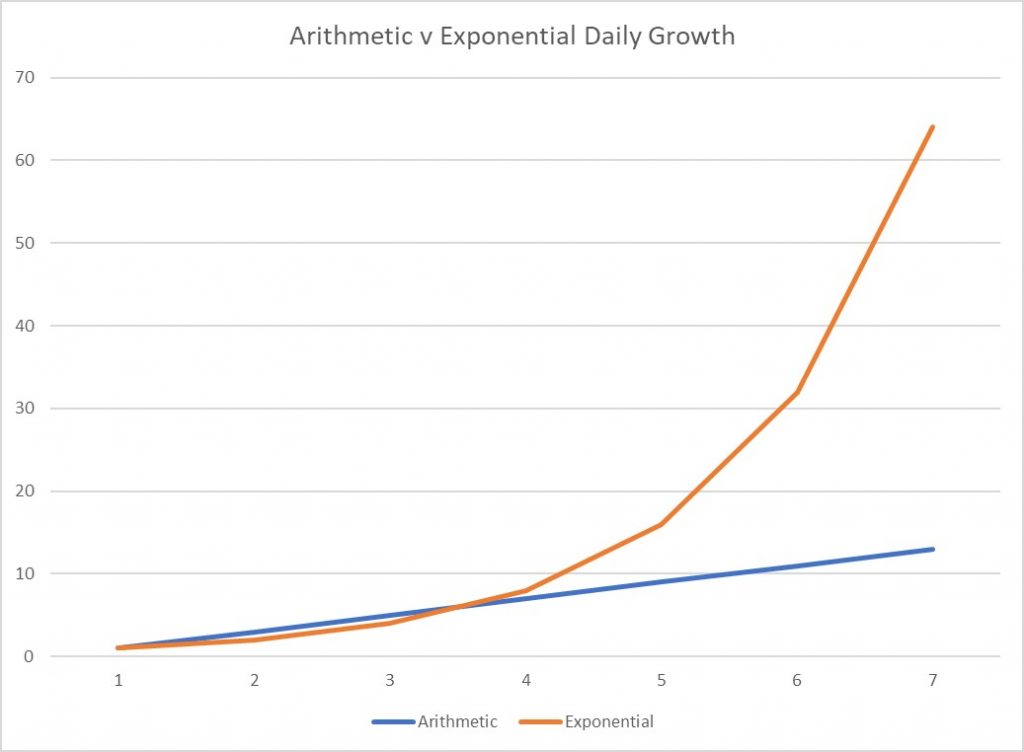
I now want to analyse the numbers of cases of Covid-19 in China, Italy, US and the UK, from 22nd January for China and from 15th February for the other countries. The difficulty in comparing data from exponential series is that the numbers can be too large to fit sensibly onto a chart. One way to deal with this is to convert the numbers into the form of logarithms. A logarithm is simply a measure of how many times we need to multiply a specific number by itself to get a second number. If we stick to one specific number for our logarithms then we call that number the base of the logarithms. In the examples of exponential growth above we went from 1 to 2, to 2×2 = 4 and then to 2×2×2 = 8. So the logarithm to base 2 of 2 is 1, the logarithm to base 2 of 4 is 2, and the logarithm to base 2 of 8 is 3. We can of course write these numbers as powers or with exponents so 2 is 21, 4 is 22 or 2 squared, and 8 is 23 or 2 cubed. It is not intuitive but it is in fact possible to assign logarithms to all positive numbers equal or greater than 1, and not just the whole numbers. This gives us the logarithm to base 2 of 1 as 0 (or that 20 = 1), and for example the logarithm to base 2 of 6 as 2.584963 (or that 22.584963 = 6).*
One advantage of the logarithm system is that we can use smaller numbers to represent larger ones, because for example the logarithm to base 2 of 4096 is 12 (or 212 = 4096). Another advantage is that if we plot successive logarithm values on a graph, a constant rate of exponential growth will appear as a straight line and can be measured by the slope of the line. It will be clear, from changes in the slope of the line, whether growth is accelerating or slowing. It should be obvious why it is useful to be able to gain this information about an epidemic from glancing at a line chart.
The Coronavirus epidemics in the UK, the US and Italy are all currently showing the same rate of growth
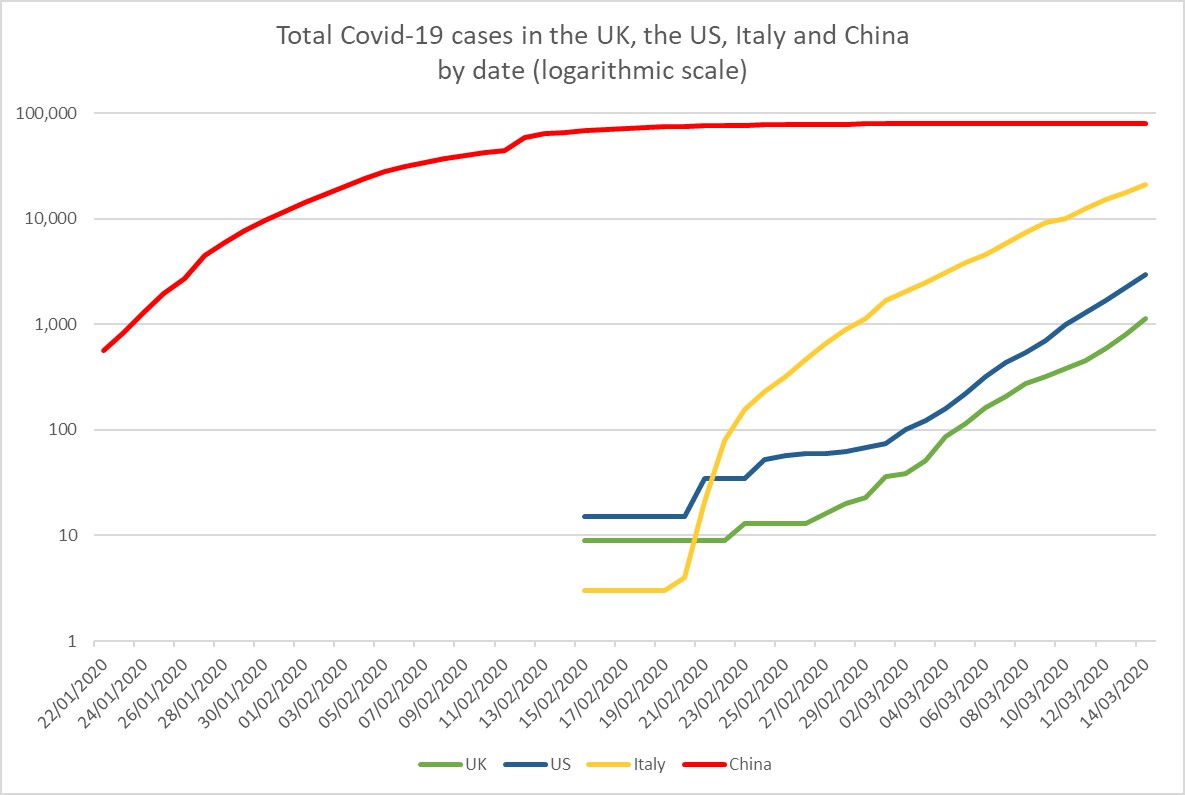
Chart 2 above shows the total number of confirmed cases of Coronavirus by date in four countries: UK, US, Italy and China. Although the vertical axis shows case numbers, the scale is arranged according to logarithm values (in this case with base 10), thus the distance on the axis between 1 (100) and 10 (101) is the same as that between 10 (101) and 100 (102) and between 100 (102) and 1000 (103). As pointed out above, this means that a constant rate of exponential growth will show as an upward sloping straight line. The degree of slope indicates the rate of growth. Ignoring China for now, we can see that the initial patterns of confirmed cases in each of the other countries are quite different. This may be due to how the disease reached these countries, or how quickly widespread testing was initiated. What is more significant is that from two weeks ago (around the 2nd of March) the slopes of the exponential growth in each country have been constant and more or less the same. In fact from that date the daily growth rate of cases has approximated 1.3 in each country – that is to say that by multiplying one day’s cases by 1.3 we can approximate the number of cases for the next day. The actual number of cases in each country and on each day varies, but because of the higher initial number of cases rather than different growth rates. The importance of this finding is that the UK and the US can take no reassurance whatsoever from the fact that their current numbers of cases are significantly less than that of Italy.
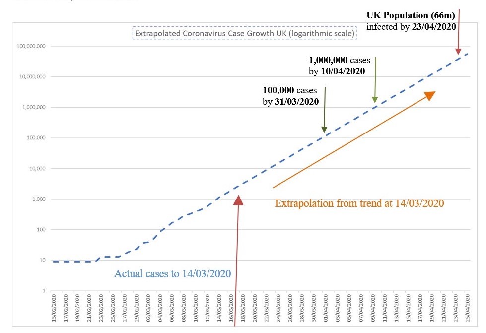
If the current rates of case growth were to continue, within a few weeks whole populations would in any case be infected. Chart 3 below shows this projection of the current rate (at 14/03/2020) for the UK.
It is unlikely of course, that this growth rate will continue until the whole population is infected. People who have been infected should acquire some immunity (although we do not know for how long this might last) and so spread should slow as this number becomes significant. We can also be hopeful that measures to reduce transmission of infection, such as reducing close contact, regular handwashing and disinfecting of surfaces, and ‘social distancing’, will be effective in reducing the growth rate. It should be noted however that the rate has now been constant in the UK, the US and Italy for at least two weeks despite the measures that have been taken in those countries.
The Chinese response to the Coronavirus outbreak
If we go back to our second chart above we can see that the Chinese Covid-19 epidemic ran well ahead of those of the other three countries on the chart, and from the start of the period covered up until the 30th of January the case growth-rate was very similar to that currently seen in the UK, US and Italy. After this point there was a dramatic and constant reduction in the case growth rate over the next three weeks until the number of cases levelled off at around 90,000. Given the population of Hubei province (around 50 million people), never mind China itself, it seems implausible to explain this reduction in growth rate as a consequence of the natural evolution of the epidemic, so we need to look at the steps the Chinese authorities took around this time, or probably more relevantly, given the incubation period of the virus, about a week before the start of the reducing rate. In fact, from around the 23rd of January, the government ‘locked down’ Wuhan and neighbouring cities and huge effort was expended to track down and isolate contacts of confirmed cases. No doubt a population generally compliant to an authoritarian central government helped achieve this outcome, but it appears to be an extraordinary result nonetheless. There is also the question as to what happens when the restrictions on travel and social life are lifted – will the epidemic simply resume? Nevertheless, from the charts of UK, US and Italian case growth, a ceiling of 90,000 would probably now be an acceptable outcome in these countries.
What Do Mortality Rates Tell Us?
The mortality rate in China to date from all confirmed Coronavirus cases has been 3.97%; that in Italy 7.31%; in the US 1.84%; and in the UK 2.52%. On the other hand, including all test-positive cases without symptoms can produce mortality rates as low as 0.7%. Apart from the natural effects of the virus and the efficacy of treatment, observed mortality rates at any time among confirmed cases of Covid-19 will depend on various factors. These factors are the extent to which acute health services are overwhelmed – as appears to have happened in the early stages in Wuhan and in Northern Italy, whom is being tested – from all contacts and symptomatic cases to only those ill enough to require hospital treatment, and where the region is on the case growth curve – if cases are growing rapidly deaths will lag behind confirmed cases to give a misleadingly low mortality rate. Considering these factors suggests that the Chinese rate may well be the benchmark rate, with the Italian rate excessively high and the US and UK rates at possibly the lower end of what might be expected in the longer term.
Prospect for the UK in the weeks ahead
The UK government, on the advice of its medical and scientific advisors, have opted for a strategy which does not target the total number of Coronavirus cases by aggressive contact tracing and testing. Instead the aim is to protect those at greater risk of severe illness and death due to age or to chronic heart, lung or immune-deficiency conditions, by isolating them and those with likely symptoms, whilst allowing ‘herd immunity’ to build up gradually in the younger, fitter population.† The apparent rationale behind this approach, which is somewhat at odds with that used and recommended by the World Health Organisation (WHO), is firstly that the necessary restriction of movement and social life is not feasible in a liberal democracy such as the UK, and secondly that suppression of viral spread now is likely to be followed by epidemic recurrence later on. The success of this strategy depends on some unknowns, such as the degree and length of subsequent immunity provided by natural (as opposed to vaccine-induced) Covid-19 infection, the degree to which asymptomatic virus carriers transmit the disease, and the ability to restrict the severe illness and mortality rate by such hygiene and ‘social distancing’ measures as are recommended and undertaken.
Since the UK government have announced that they are going to scale down the numbers tested for Coronavirus infection, we are likely to see a reduction in the growth rate of confirmed cases irrespective of the actual spread of the disease. As such this number would not be a good indication as to whether or not the government’s herd immunity strategy was succeeding. More relevantly we will need to monitor the number of critical cases and deaths. With the assumption that herd immunity requires about 60% of the population to be infected, and that the expected whole population Covid-19 mortality rate is 0.7%, then a simple calculation tells us that ‘success’ would eventually be represented by about 280,000 deaths associated with the disease.
* In fact the logarithm of 1 to any base is defined as 0. So 20 = 1, 30 = 1, 40 = 1, and so on.
† ‘Herd immunity’ is resistance to infectious disease that occurs when a large percentage of a population has become immune to an infection, and so by disrupting chains of transmission also provides protection for individuals who are not immune.